


The customer sent a photo with one sentence: the color of this batch of screens is not quite right.
The engineer flipped through the specification sheet and read it out: 100% sRGB, 16.7 million colors, color temperature 6500K, brightness 300nit. Each item is correct.
Both sides are correct. We just can't talk together.
This kind of scene has almost always been encountered by those who make screens, select screens, and inspect screens. In the end, it's often not the screen that's broken, it's the two words' color 'that are not the same thing on both sides' minds.
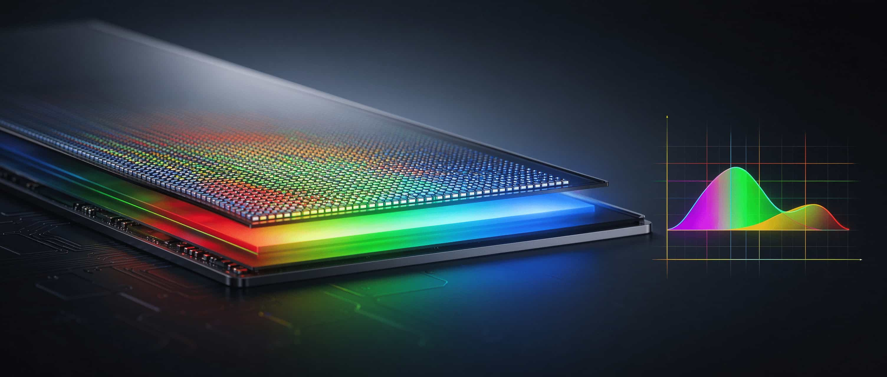
Today we won't use any formulas, we'll remove the colors of the LCD screen from the inside out. After reading it, you can do three things: understand the specifications, know which questions to ask the supplier, and avoid making excuses during acceptance.
It's a bit long, I suggest collecting it first and passing it on to colleagues who work on products, procurement, and hardware.
1、 Colors are made, not adjusted
The LCD screen does not light up.
The red you see is a row of white LED lights on the back first. The LCD layer acts as a faucet, controlling how much light is emitted from each point. After passing through three color filters of red, green, and blue, they are mixed together to produce the desired color.
The order is as follows: the backlight spectrum determines how much raw material is present, the filter determines whether it can be thoroughly screened, and the driver gamma、 The white balance adjustment determines whether this pot of rice can be cooked.
One sentence: Color is made, not adjusted.
The red section in the backlight is already weak, and no matter how expensive the filter is, it cannot produce a full and bright red color. The spectrum is sufficient, but the calibration hasn't kept up. Should it be biased or not.
The number "16.7 million colors" is only divided into 256 levels of red, green, and blue, which adds up to 16.77 million combinations when multiplied. It says' how many levels can be divided ', which is different from' whether the color is accurate '. Don't use 16.7 million colors as evidence of whether colors are good or not.
2、 Same color temperature, not necessarily the same color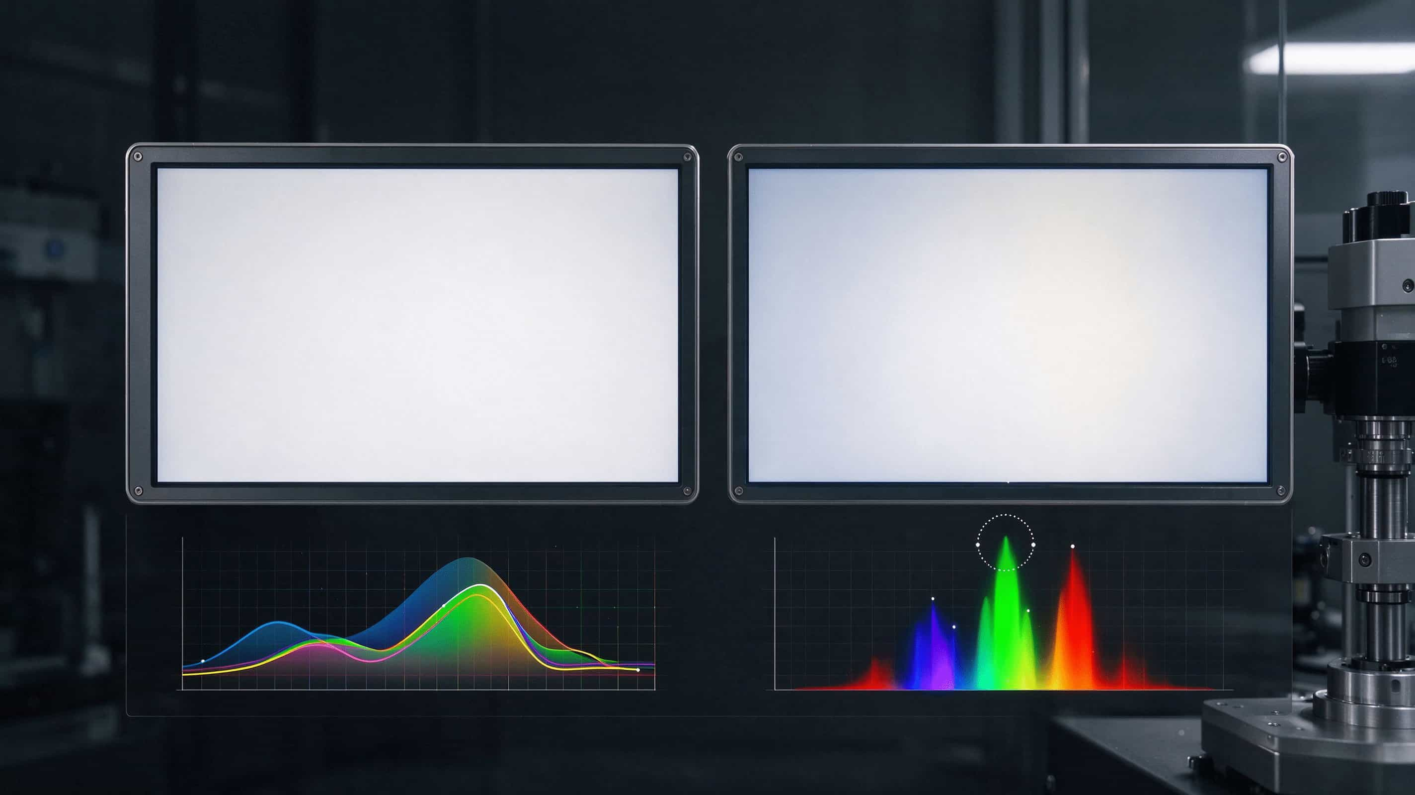
The cone cells that regulate color in the human eye can be roughly divided into three categories. They are most sensitive to long wave, medium wave, and short wave respectively.
The eyes do not read spectra. It only reads three signals. Different lights, as long as these three paths are grouped together, the brain recognizes the same color. In the profession, it is called 'same color but different spectrum'.
The screen deceives the eyes with three "lights" of red, green, and blue, relying on this.
But it's also a pit.
The color temperature of 6500K only indicates where the "white" falls, not how many wavelengths there are in the light. Both screens are labeled with 6500K, which looks similar to white. When it comes to the specific color, the skin tone and the red brand logo may not match.
Plus, there are subtle differences between people's eyes. The splicing of advertising machines and the mixing of different batches are the easiest to overturn here.
Don't just write 'color temperature 6500K' when requesting. Write white dot color coordinates and tolerances, and indicate consistency within the same batch. If you want to make multiple screens side by side, you need to clearly state: same batch of backlight, same set of calibration. These few sentences can block most of the customer complaints behind.
3、 72% NTSC ≈ 100% sRGB, don't equate it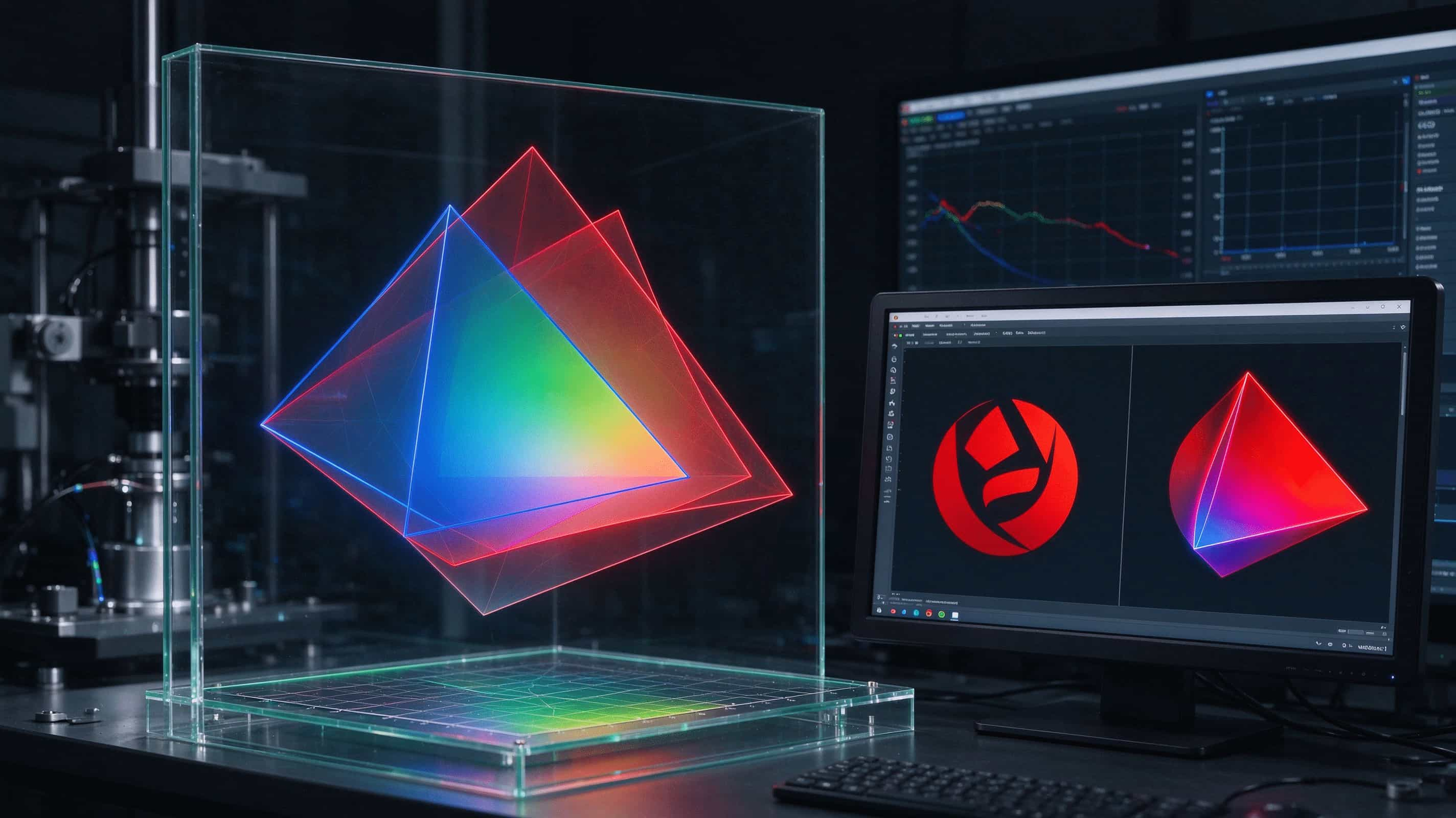
Color gamut refers to the range of colors that can be adjusted on this screen. Just look at two numbers:
Coverage rate, how much does it cover a standard box (sRGB, DCI-P3), with an upper limit of 100%.
The area or volume, how large is this frame, can exceed 100%. But 'bigger' does not mean 'more complete', even if the frame is crooked, it still cannot cover the standard corners.
The old saying in the industry is' 72% NTSC ≈ 100% sRGB '. That's similar in area, and the shapes of the two boxes do not overlap.
According to the IDC 2023 Display Panel White Paper and actual test data from DisplayMate, the sRGB coverage of a typical 72% NTSC screen is concentrated in the range of 95% -99%, rather than a stable 100%.
Write the standard name and coverage rate in the specification book for acceptance, don't confuse things with NTSC percentages.
There is a more common misconception: a wide color gamut does not necessarily mean it looks good.
The system does not perform color management. If ordinary sRGB images are fed to a wide color gamut screen, the colors will be forcefully stretched out. A sRGB red color was pulled to a higher saturation on a wide color gamut screen, causing facial redness and logo discoloration. However, customers complained about the color being fake.
Office and laptop screens, with stable coverage of 100% sRGB and reliable color accuracy, are more pleasing than the hard stack P3. When it comes to design and audiovisual, P3 also needs to be paired with a regular sRGB mode.
Wide color gamut is capability, sRGB mode is a fallback. The wide color gamut without a way out is the source of customer complaints.
4、 The four most easily overlooked lines in the specification book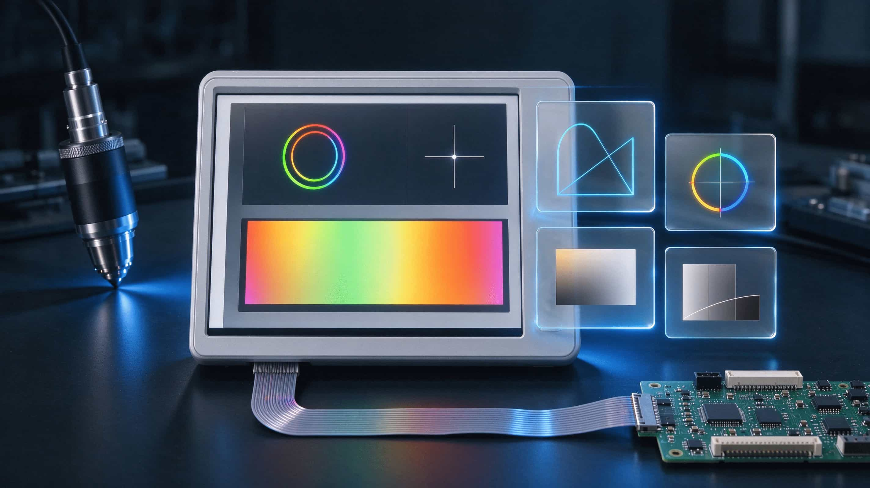
First line: Color accuracy Δ E.
What is the color and standard deviation, the smaller the number, the better. But only giving a solitary 'Δ E<2' is not very informative. To ask: What kind of Δ E is it? How many were tested? What brightness and color temperature are measured under? Do you have calibration reports for each unit?
Nowadays, mainstream laptop brands are lowering the calibration of each product, and many models have achieved an average Δ E<1 and 100% sRGB across the entire range. If you choose a laptop screen, the factory calibration report should be asked as standard, not as a bonus.
Second line: Color temperature and white point.
6500K is a rough label. The standard white commonly used in the industry is D65, defined by an entire solar spectrum, approximately 6504K, with color coordinates x ≈ 0.3127/y ≈ 0.3290. Writing 'color coordinate tolerance' is more reliable than just writing color temperature.
The low blue light mode changes the backlight spectrum. The yellow screen and decreased color accuracy are the cost of the solution itself.
The hardware low blue light solution of mainstream panel manufacturers can reduce the proportion of 415-455nm blue light to below 37% while maintaining sRGB 99% and Δ E<2. However, this is a hardware solution and is different from software filtering blue light. Make it clear in advance, don't wait for the inspection to discover 'how it turned yellow'.
Third line: Brightness.
Nit stands for cd/m ², which refers to the actual amount of light emitted, and is different from "RGB given to 255". Look at the typical values, as well as the lowest values and full screen uniformity. The advertising machine is placed by the window, and the brightness attenuation after long-term illumination needs to be considered.
Fourth line: gamma/grayscale.
The number 128 does not equal half the brightness. There is a transmission curve in between. The dark part is blurred into a patch, and the sky gradually changes into a ribbon. Don't rush to blame the panel for now.
Many 6-bit FRCs rely on jitter to "match" color depth and gamma mismatch. Creating interface gradients and design terminals, incorporating "native 8-bit" into requirements, saves time compared to putting out fires afterwards.
5、 A viewing angle of 178 ° does not mean that the color remains unchanged when viewed from the side
The perspective in the specification sheet is usually the angle at which the contrast drops to a certain value. It's not a guarantee of color.
VA has high contrast, making it prone to whitening and color distortion when viewed at an angle. IPS side view is more stable. Multiple people gather around to watch, vertical screen advertising machines, and terminals squint, IPS is more worry free.
Don't just look directly at the prototype. Walk at a 45 degree angle on both sides, up and down, and while sitting and standing. The scene of multiple screens side by side especially requires several pieces to be lit up together before viewing. The front view is good, but if you tilt it, it will split up. This kind of overturning is too common.
There is also a hard truth to multi screen side-by-side: there is inherent color difference between panels from different batches, which cannot be adjusted by software. In commercial display scenarios, having the same model and batch is the bottom line, not an option. During acceptance, play a pure white image to check for color difference. If the brightness consistency is below 95%, simply send it back.
6、 Don't conquer the world with just one specification sheet
Pen/office monitor: 100% sRGB coverage, factory Δ E report, brightness range of 250~300nit, power consumption and thickness. Wide color gamut is usually not a must-have. Remember to discuss the "cost of yellowing" together with the low blue light solution.
Design/Video Display: P3 or Adobe RGB coverage, with sRGB mode, factory calibration report per unit, full screen uniformity. The average Δ E<1 is the starting line in this scenario, not the ceiling.
Advertising machine/commercial display: high brightness, white point consistency, multi screen splicing of the same batch and level, color and brightness attenuation when lit for a long time, vertical screen viewing with biased characters. Multi screen side-by-side acceptance: pure white images with color difference, brightness consistency ≥ 95%, and hard threshold for backlighting in the same batch.
Industrial/terminal equipment: white point drift under wide temperature range, readability under strong light, interface and gamma matching, batch traceability.
The sizes range from 10.1 to 31.5 inches, with significant differences in scene and prioritization of color requirements. First explain the scene, then talk about the parameters. Both quotation and sampling should avoid detours.
7: Ask these four questions when making a request
You can directly screenshot and post it in the group.
First sentence: Target color gamut, write standard name coverage. Don't just give NTSC percentages.
Second sentence: White dot, write the color coordinate tolerance for consistency with the batch. Don't just give color temperature.
The third sentence: Color accuracy, write whether the Δ E type threshold test conditions have been calibrated and reported for each unit.
The fourth sentence: Acceptance, write the four states after aging with multiple screens lit up side by side in front and side view.
These four sentences are more effective than holding three specification review meetings.
Ultimately, the color is not mysterious.
Just the raw materials, the screen is the kitchen, the human eye is the judge, and the specification sheet is the menu.
Beautiful parameters do not mean delicious food on the table. A convenient cooperation is to clarify in advance what conditions, what to observe, and how much difference is considered qualified.
We produce 10.1-32-inch LCD display modules during the competition. 10.1, 10.8, 11.6, 13.3, 13.6, 14, 15, 15.6, 18.5, 22, 23.8, 27, 31.5, these sizes are passed on the production line every day. Monitors, laptops, advertising machines, and terminal devices are just a few of the things that need to be asked repeatedly.
Instead of pulling back and forth, it's better to align before the meeting.
Which pitfalls have you encountered in screen selection and inspection? Chat in the comment section. I think it's useful, give a like, and pass it on to my colleagues in product and procurement. Next time we have a specification review meeting, we can save half an hour of noise.
#LCD Screen # LCD Screen # Color # Color # Screen Selection # Screen Avoidance # Color Accuracy Δ E # LCD Display Module # Acceptance Tips